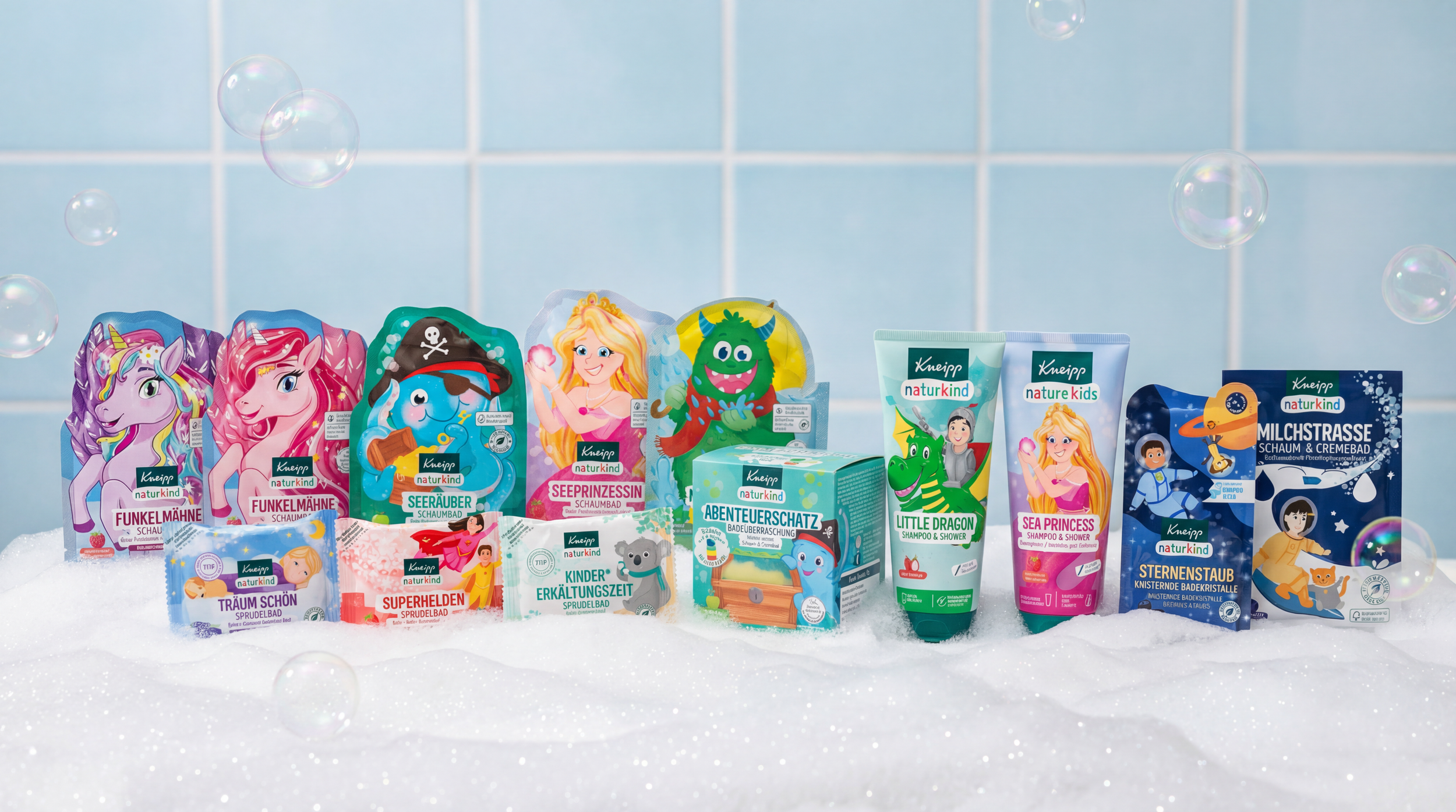
Kneipp Naturkind
Client: KNEIPP
Agency: Scholz & Friends
Services: Packaging Design, Illustration
2020-23
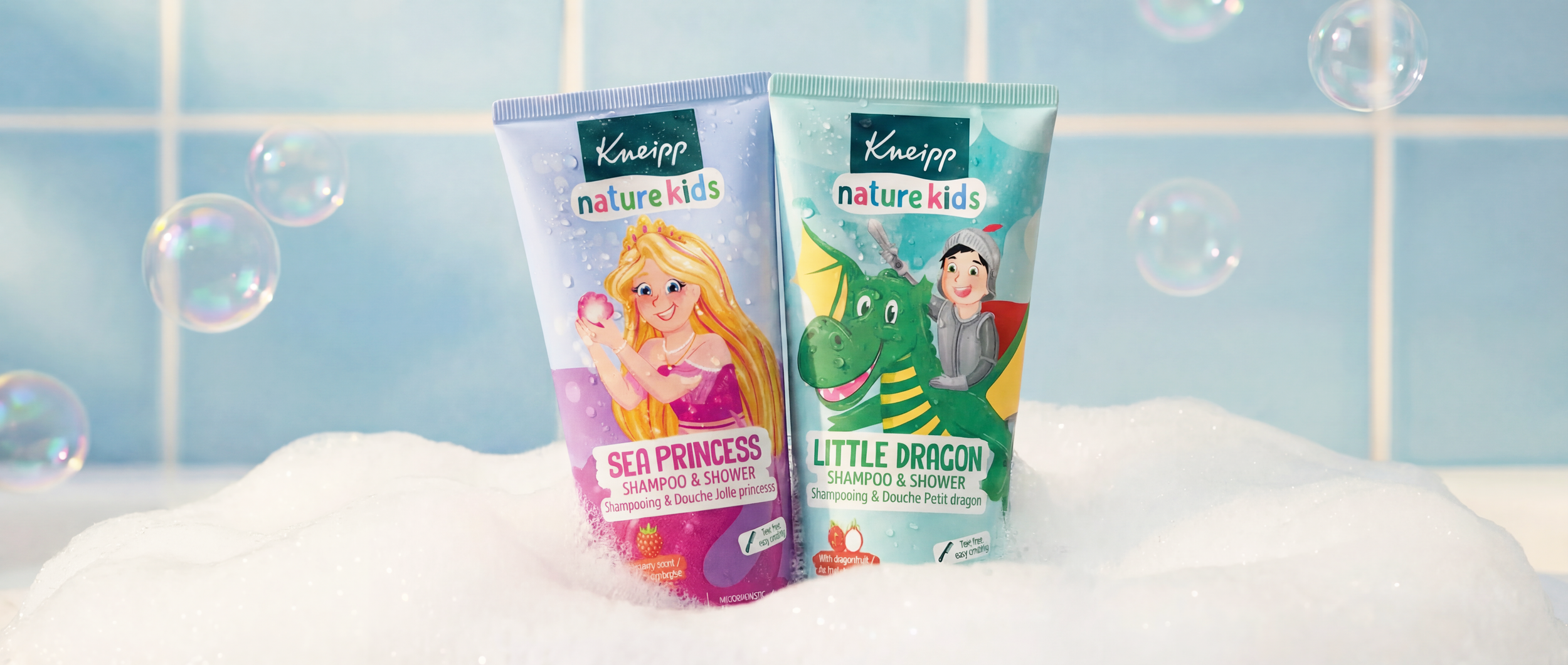
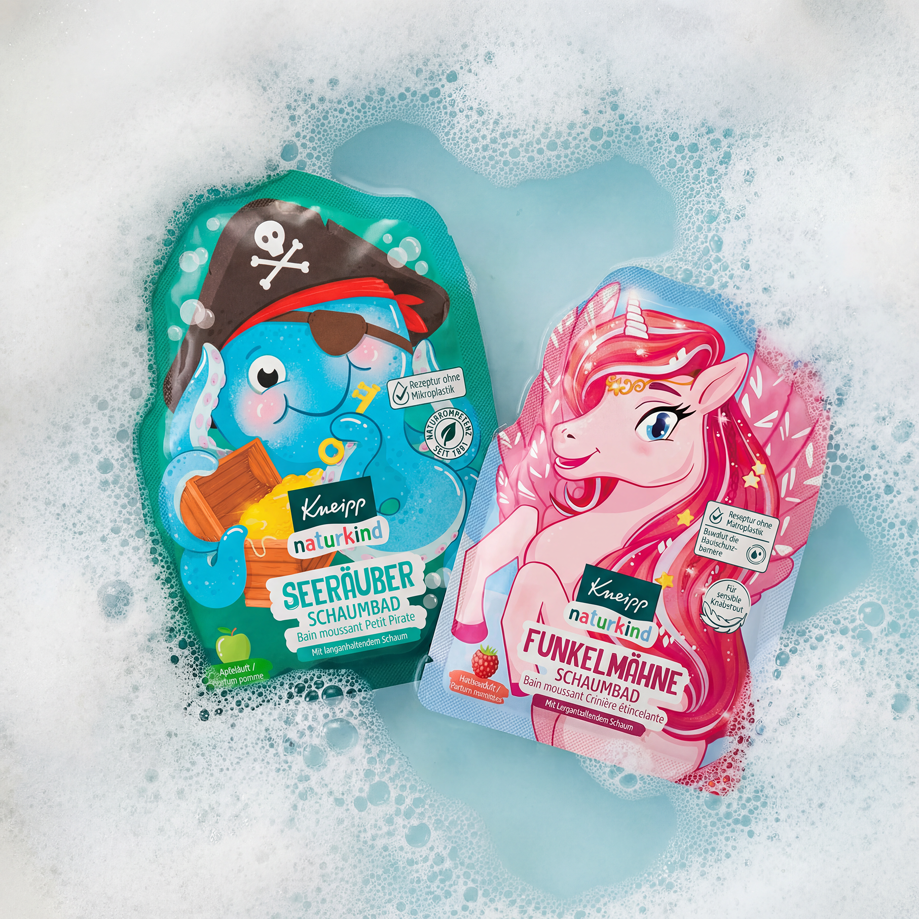
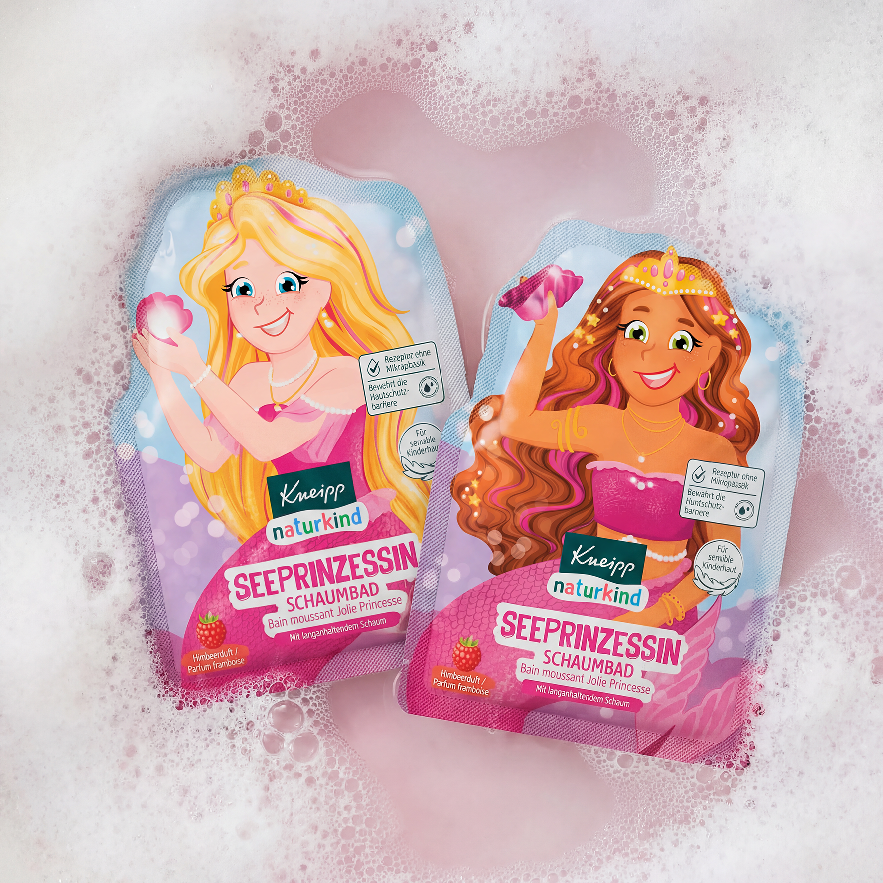
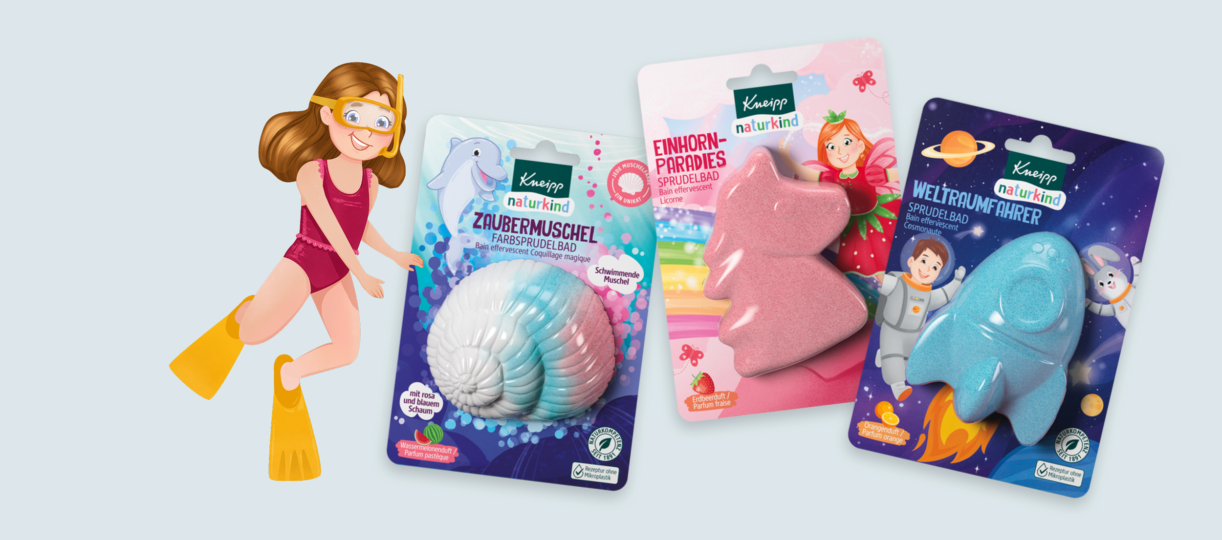
Kneipp Naturkind turns daily bath routines into a small, joyful ritual for kids, combining gentle care with playful design. The range offers colourful bath products that make bath time feel like playtime, while keeping a focus on quality and a parent-trusted brand.
Bold characters and clear, cheerful packaging create strong shelf impact and help families choose quickly. The result is a portfolio that kids are excited about and parents feel good bringing home.
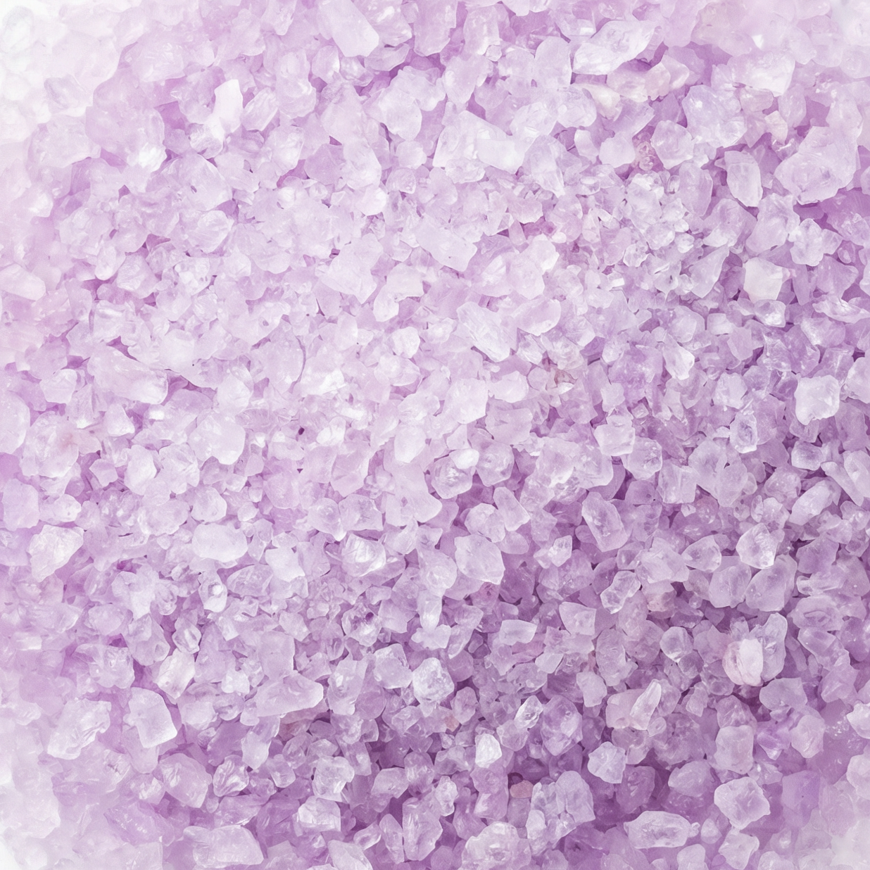
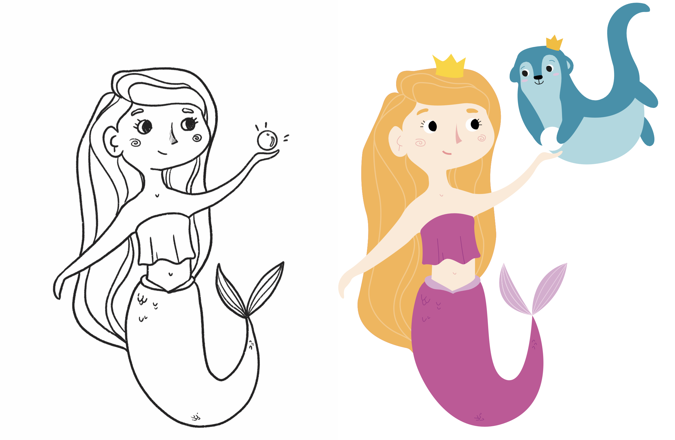
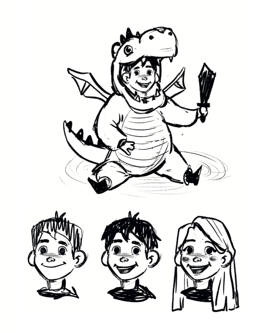
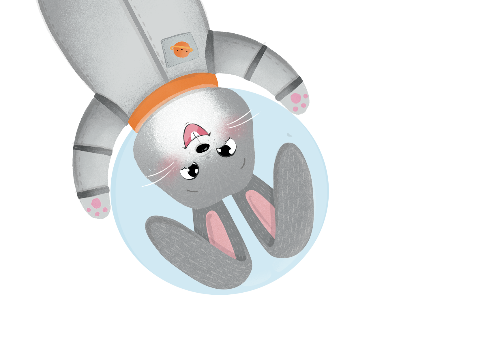
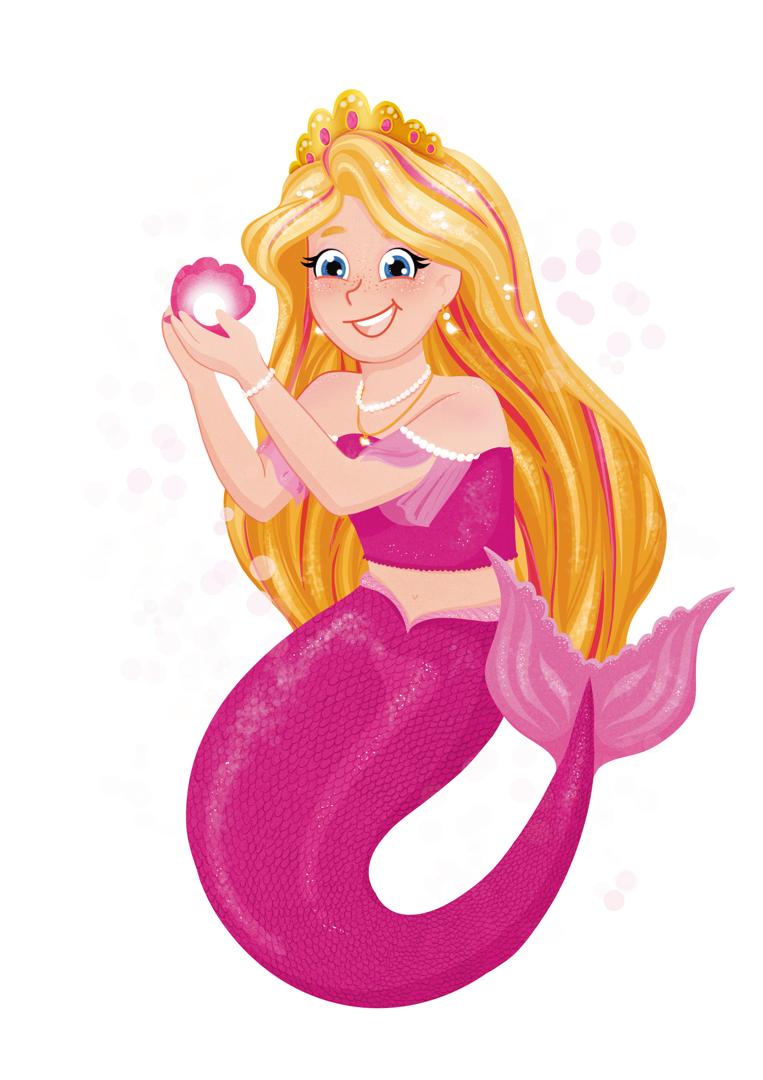
The characters were designed to feel instantly approachable, fun, and highly recognisable across the range. I explored different illustration directions—from more detailed, textured looks to simplified, graphic styles—to find the right balance between playfulness and clarity.
Along the way, I tested shapes, proportions, and levels of detail to ensure the characters stayed readable at small sizes and worked across multiple formats.
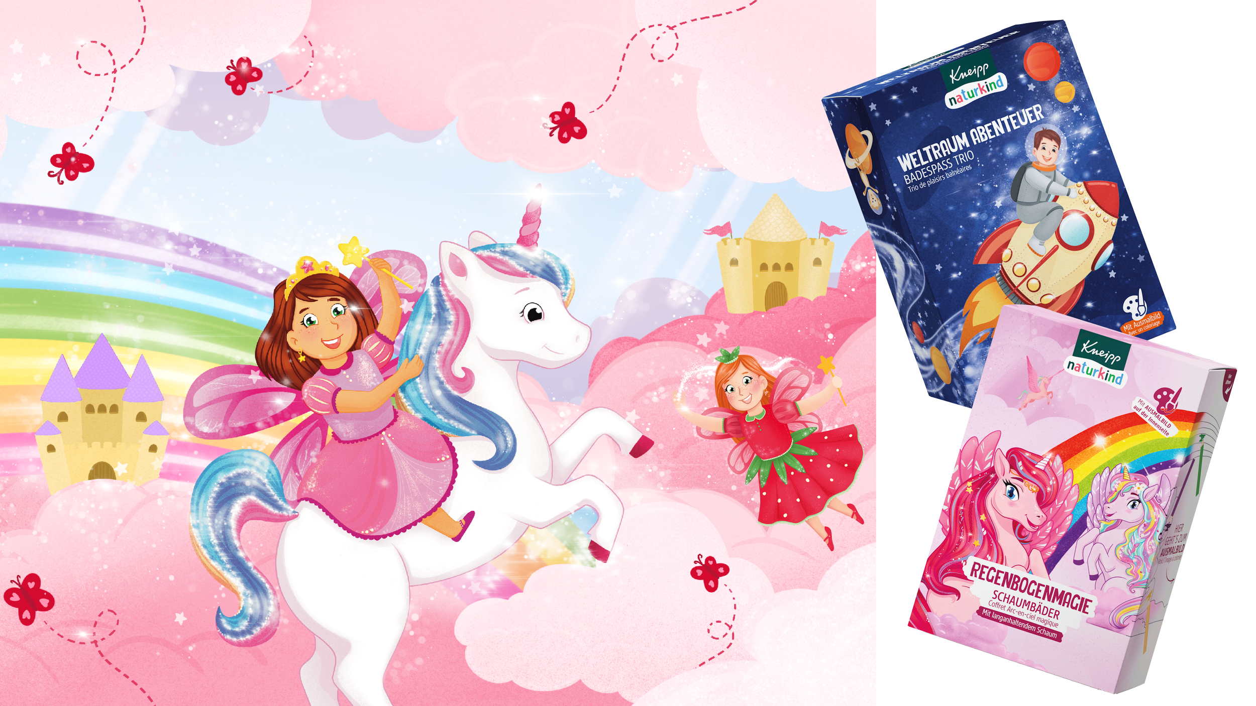
The final style leans on cheerful palettes and engaging expressions, giving each character its own personality while keeping the overall world cohesive.

Bath time is a daily routine, but for kids it can also be a stage for imagination. Naturkind taps into that by pairing each product with engaging characters and bright, story-like worlds that invite play. The illustrations create a quick emotional connection: kids spot a favourite figure and immediately know what they want to use. Colour and character turn the bath into an “activity,” helping the routine feel lighter and more positive. The range stays intuitive for parents, too: easy to pick, easy to understand, and easy to integrate into a regular schedule. The overall effect is a bath ritual that feels less like a task and more like a shared, positive experience.

Little stories, big fun.